 Submitted by Katie Hellmuth on | 0 Comments
It's not a surprise to me that MSNBC Your Business calls it "startling" that new research is claiming that "91% of small and medium size businesses don't have a mobile optimized website, and only 15% said they had plans to do it." As a former website designer, I've worked with a lot of small businesses, and as a co-founder of Tin Shingle, I hear the stories and hesitations of small businesses when it comes to dealing with their websites. The common thread? They suffer from analysis by paralysis.
Building a mobile website is no small feat. It's no surprise to me that only 15% of small and medium sized small businesses have plans to build a mobile friendly website. It's amazing that they have a website at all, since many small businesses, especially those who have partners, can be discussing plans for their websites for months, and never actually get them up and running.
Here is why this statistic doesn't surprise me:
-
If the Business Has a Website at All, it Still Works on Mobile...It Just Looks Really Tiny: Just because a company didn't build an official mobile website doesn't mean they are missing out on people hitting up the website from their phones. Most websites still work on a mobile phone, they just look really small. Therefore, a business owner feels no immediate need to quickly develop and pay for a mobile version. Sure it would be nice, but maybe instead of a mobile version, the business creates an app for that. ;) Now, as Jason Spero from Google implies in his interview with MSNBC pictured here, there are SEO implications with only having your website as an app - it won't get found in Google or other search engines because it lives in the App Store, which isn't the same as having a website. So a business wouldn't want an app as their only "website," even though it's mobile friendly.
-
Budget: Unless the business is designing their website today (as opposed to 5 years ago when mobile templates did not come with out-of-the box website design templates), using a pre-existing template from a website service like Wix or an industry specific service like in the real estate sector, Delta Media, creating a mobile site will be an extra cost. In the MSNBC interview, Jason calls it "inexpensive and quite easy". But he adds that the business needs to think about its user, and how you want them to experience your website. Unless you're already going to overhaul your website in a redesign, you have a job ahead of you to work with a website design team to deconstruct your website to strip parts away to fit it into a mobile website design. Jason suggests using Google's new product GoMo, which as of this blog post, can't even be Googled ;) so I can't find it to share the link with you.
-
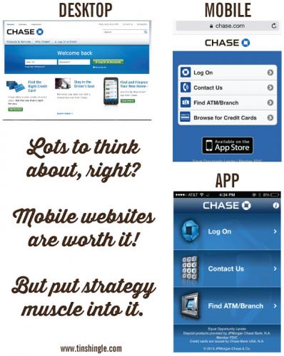
What Gets Cut? The beauty of phone apps is that they cut out the clutter of a larger website, thereby making it easier to find key actions. Chase Bank's online banking, for instance, is extremely easy. Pay your credit card, mortgage, transfer money, it's all done within clicks. That means that a business needs to cut the additional stuff on their website in order to fit in in a thumb-scroll, narrow screen. The business needs to commit to a few core actions that a user can take on their website. When a person is navigating a website on their mobile phone, they are thinking in an entirely different way than they are on they desktop. On their desktop, they are typing with two hands, instead of typing with their thumb or index finger. They are clicking on a trackpad or (gasp) with a mouse, as opposed to side swiping. Major navigation areas are broken down into images and symbols rather than long words. It's a mind-bend to turn a regular website for desktop into a modified version for mobile.
Apps for businesses tend to be more functional. Ivan Expert, an Apple tech support company released an app that just let's clients contact them with the push of a button. Sure, people could put Ivan Expert's digits in their Address Book, but clients seem to like having an official app to launch and press that emergency HELP! button when they need tech support.
Oftentimes, the best apps and mobile websites from companies focus on what the person could do at their website, and strip away the rest. Look at Chase Bank's online situation, for instance. You never need to go to Chase's website from your phone if you have Chase's app because you can easily pay your bills, transfer money and deposit checks from the app. In fact, going to Chase's website from a phone doesn't even produce the desktop version of the website at all, and directs a user to their app in the App Store. See how the Mobile version looks simular to the App version?

On the other hand, a real estate website like Glencairn Forest used to look tiny on a mobile phone. All of the floor plans of homes with downloadable specs were lost to a prospective buyer searching while on the go. This year, Glencairn redesigned their website using a Wix template, and instantly their website was mobile friendly, because a mobile version of their website came with the Wix template they built their website on.

So, there are options for creating a mobile-friendly site, but it's not as point-and-click as one may think (unless a business was already thinking of redesigning and rebuilding their website as Glencairn did), causing me no surprise that small businesses are proceeding slowly to make this change.
What about you? Do you have a mobile friendly website? Did you go through a major change to develop one?
Share your thoughts in the comments below!


