in: Packaging
by: Erin Schiffman

Social media and the advancement in printing technologies are making packaging and branding possibilities more creative and exciting this year. Below are a few trends that are gaining popularity…

GREEN PACKAGING
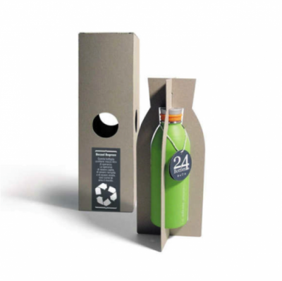
One of the most important top trends in packaging continues to be sustainable and environmentally friendly (biodegradable or recycled) packaging in 2014. Brands big and small are jumping on this trend, and are even using it as an additional selling point. A lot of our clients are seeking out affordable green packaging. For our smaller clients, it is a slow process, but they are finding it is well worth it in the long run.Image credit: Trend Hunter

KRAFT PAPER
Kraft paper, which is traditionally used for grocery bags and butcher paper, can look really luxurious depending on fonts, colors, stickers, etc. used and follows suit with the green packaging trend as it gives off an organic, recycled vibe. Here is an example of kraft paper used for an indie luxury beauty brand Olie Biologique.
Design Secret Tip: You'd think it was a specialty paper because we placed a design of wood grain on the paper to give it an original, organic look.
Image credit: Schiffman Creative

GRADIENTS ON PACKAGING
With the advancements in the printing industry, we believe that gradients are going to make an appearance on primary packaging, which has never really been done before with as much technical assurance. Gradients are color progressions that use one color and different saturations or a couple of colors with different saturations. There are a few brands that are doing this now and I think we could see more of it this year.
Image credit: Tria Beauty by way of Tom Checker's Pinterest

LESS STRUCTURED DESIGN & MORE PERSONALITY
More free flowing graphics and fonts with less boxy containments for logos, tag lines, and titles are gaining popularity as brands are more willing to break the rules and convey their unique personalities. A few ways this is being accomplished is through bright vibrant colors, interesting fonts, patterns and realistic images.
Image credit: Suja
Image credit: Vitalize, design by Kate Bradford at Parker Williams via DZINE - Packaging Design
It is great to be aware of trends and to follow along if they make sense for your brand, but there are two important things to remember when tackling your packaging project:
ALWAYS STAY CONSISTENT!
One of the most important factors of successful branding and packaging is staying consistent across the board. When your customer visits your website, social media pages and then purchases your product, it must send the same visual message.
ALWAYS STAY TRUE TO YOUR BRAND
If you are confused then you customers will be confused. Confused consumers = Loss of sales. Determine who you are prior to jumping into any branding or packaging projects and stay true to whatever your core values are across all visual communications.